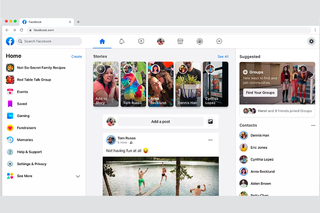
 Social networking giant Facebook has begun to appear in new guises. The March 7 event officially unveiled the preconceived notion. Encouraged by the mobile platform, the company has come up with a new look for the computer version of their website with the same flavors as the Android and iOS versions.
From now on, you will be able to view content separately on a specific topic in your news feed.
What’s even more noticeable with the other changes is that once the new design is introduced, the ads displayed on the site may take up more space (up to one third of the monitor!) Which will be difficult to avoid. Chris Struhr, the project’s chief engineer, declined to comment on whether the redesign was ad-hoc. He pays less attention to the idea that people will spend more time on the site. Instead, they wanted to make the posts in the news feed more interesting.
There are three main changes:
> Three column rich website has been brought in two columns in new design. The news feed will be displayed across more areas of the screen. Status, pictures, videos, etc. will be shown in a larger format than before. The text describing the link will be relatively short.
> App bookmarks, selected friends profile links, chats, calendars and live update tickers have been added in a black pop-out bar on the left side of the screen.
> In the new design it will be possible to see the general news feed as well as the topic specific feed. You can also get your customized list updates (status, photos, videos, links, following profile content, etc.) on the homepage along with the story displayed in Facebook’s automated algorithm. In the new design, only the letter “F” has been placed in the Facebook logo instead of the whole spelling. The mobile version is being made easier to use GPS.
While not everyone around the world will get a new Facebook news feed at once, it will be launched gradually. If you want At this link You can get a little faster by visiting the “Waiting List” list.
[★★] Want to write about technology? Now one Technician Open an account and post about science and technology! fulcrumy.com Create a new account by visiting. Become a great technician!
