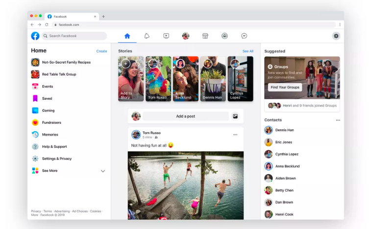
 New newsfeed design last week Launched Facebook. This time Of fanpages Launched redesigned interface for Announcement Gave the world’s largest social networking site. The new design will come in the desktop version of the Facebook fanpage within this week.
The biggest feature of this redesign is that the fanpages will again display posts in a single column. Facebook At the beginning of the timeline launch, posts were shown in two columns on the user profile and fanpage. Later, however, the single column view for the user timeline came up. And this time the company is going to adopt the same policy for fanpage.
Facebook says that in the new design, both the admin and the page fan will get the content according to their respective needs.
 The mini column to the left of the updated Facebook page will display various page information such as maps, phone numbers, website addresses, photos, videos, etc.
Facebook To read a post in a two-column design of the page, users have to scan both right and left at the same time, which sometimes causes confusion. The site seems to have no problem with just one column.
This is the direction of the users. The new design also has some advantages for page admins. When it is turned on, quick links like Page, Activity, Insights, Settings etc. can be found in the floating bar at the top of the page. On the right side side bar, page notifications, ads, new likes, etc. statistics can be seen. Also coming is the ‘Pages to Watch’ option through which you can compare the performance of your Facebook page with other pages.
So, how did the new Facebook page update? Has a new design been launched on your Facebook page?
[★★] Want to write about technology? Now one Technician Open an account and post about science and technology! fulcrumy.com Create a new account by visiting. Become a great technician!


