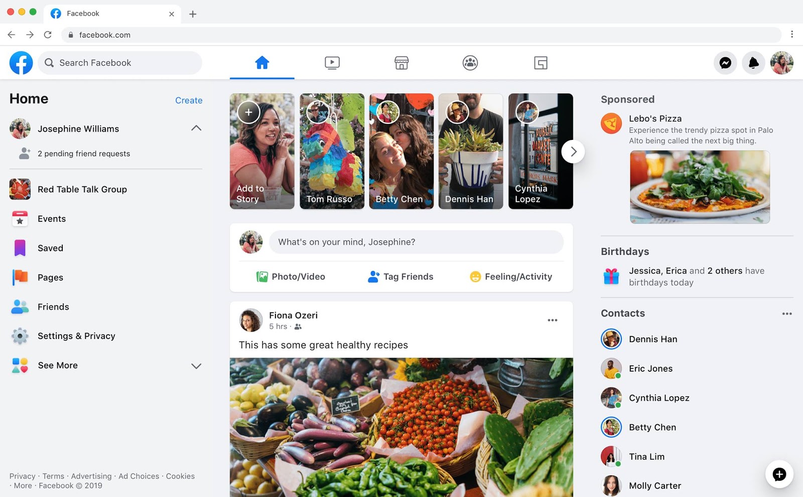
 Facebook has come up with a new newsfeed design. The social networking company unveiled the new look of the global site from late night on Thursday, March 8, Bangladesh time. Now Icon Design, Font Look, and Newsfeed Content Display Fetched update Facebook.
If you are a regular visitor to our blog, you must remember, exactly one year before today, i.e. March 7, 2013, another one. Large newsfeed redesign Published by Facebook.
However, the amount of design change that was talked about by Facebook last year did not see the light of day. This time the new design has been developed keeping those issues in mind.

This new design has been seen in the computer and mobile versions of Facebook since this morning. It has bigger buttons than before, like noticing clear font layout. Photos are being shown all over the landscape of Newsfeed, which is new Facebook One of the most notable updates to the template. The ‘Update Status’ and ‘Ad Photos / Videos’ icons on the homepage also have a touch of new design. The home and profile buttons on the top right of the notification bar at the top of the older version are now visible on the left. And now the user’s picture is also being displayed in the profile link.
However, the new design of Newsfeed will not affect the Newsfeed algorithm. As a result, your status / updates will still be as rich as before. This new theme update will reach everyone’s account in the next few weeks.
Is there a new look on your Facebook account? What does the new design of Facebook look like?
[★★] Want to write about technology? Now one Technician Open an account and post about science and technology! fulcrumy.com Create a new account by visiting. Become a great technician!




![Read more about the article Facebook down for the third time in two weeks [আপডেট]](https://fulcrumy.com/wp-content/uploads/2021/12/facebook-down-for-the-third-300x200.jpg)
