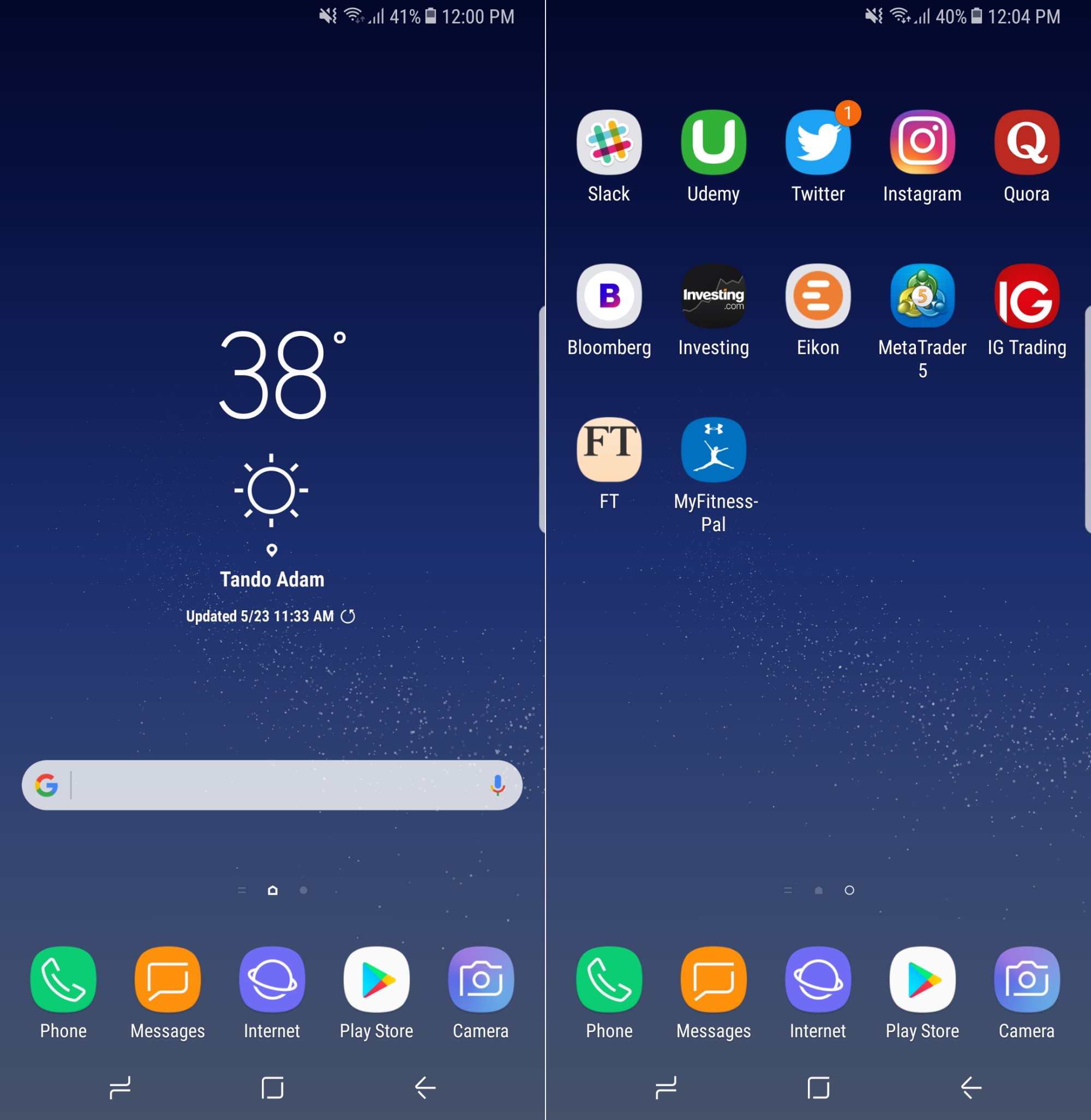
 The Twitter account Evlix has a reputation for leaking information on all new smartphones in advance. This time they leaked Did Home screen of Samsung Galaxy S5. The smartphone is expected to hit the market in the first half of this year.
The ‘Galaxy S5’s homescreen’ in the picture above is basically a card-based design. It shows various online orders of the user, sports updates, flight schedules, social contacts, concerts, appointments etc.
According to the picture, Samsung The user interface of this next flagship Galaxy phone looks a lot like Microsoft Windows Phone 8. Google Now’s card-based UI is similar to the one shown in the picture.
Earlier, another one was posted by Evlix on January 7th In the picture The standard application icon is also seen with the card design in the image claimed to be the homescreen of the Galaxy S5.
If these images from Evlix are real, then they are still in the early stages and it is not certain that the smartphone will come to the market with this design. So if we want to see the real look of the Samsung Galaxy S5, we have to wait a few more days.
[★★] Want to write about technology? Now one Technician Open an account and post about science and technology! fulcrumy.com Create a new account by visiting. Become a great technician!


