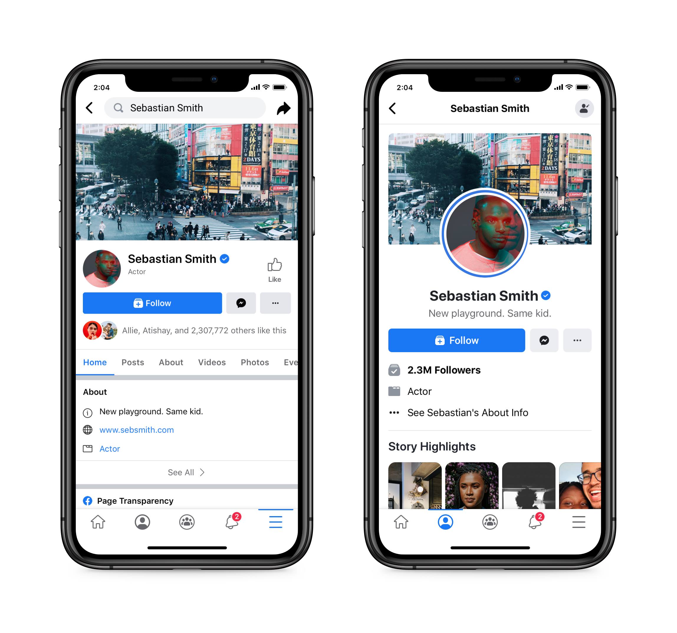
If you are using Facebook app on mobile then you can see the new design on its profile page soon. For some time now, Facebook has been testing multiple new designs on some users’ profile pages.
One such user suddenly saw a different look on his Facebook profile and posted the picture on Twitter with a screenshot from there.

As seen in that screenshot, the new experimental design brings the user’s profile picture to the center at the top of the page, which was previously on the left. And below the profile picture is the username. The cover image above is the same as before. The new design looks a lot like Google Plus. The only difference is in the shape of the profile picture. The profile picture of Google Plus is round, and in this design of Facebook, the picture is square.
Facebook itself is sure of this new design Has done. However, the company did not say when the experimental layout would be released.
[★★] Want to write about technology? Now one Technician Open an account and post about science and technology! fulcrumy.com Create a new account by visiting. Become a great technician!


