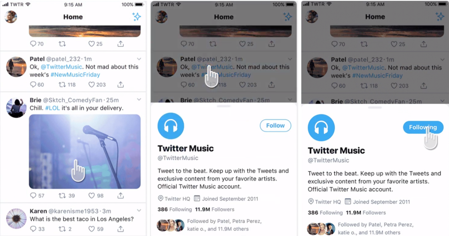
 Microblogging site Twitter is currently testing a new profile design that looks a lot like Facebook and Google Plus user profiles. An editor at Mashable made this massive reshuffle on Twitter on Tuesday Profile page See. It shows the user’s original profile picture and biographical information on the left. Twitter’s new profile design also has a header image, similar to the Facebook timeline.
Experimental in this tweet stream Twitter It has moved away from its traditional vertical design. The focus has been on photos and content cards.
At the bottom of the cover photo are added user tweets, photos / videos, following, followers, number of favorites and view lists menu. Content is displayed in two columns on this profile page in beta version.
At the moment, the new design has been piloted on a certain number of users’ Twitter profiles. Hopefully in the near future it will be launched for everyone.
[★★] Want to write about technology? Now one Technician Open an account and post about science and technology! fulcrumy.com Create a new account by visiting. Become a great technician!


